top of page
All Posts


What is data storytelling? (And why it matters for your team)
Most teams that work with data are good at analysis. They can pull a report, run a model, build a dashboard. The hard part comes after these things, when they have to communicate what they found in a way that changes something. That's where data storytelling comes in. What is data storytelling? Data storytelling is the practice of communicating data insights using narrative. It's how you explain what the numbers show—along with what to do about them. It sounds simple. But it'

Kat Greenbrook
4 min read


Data storytelling vs data visualisation: what's the difference?
Data storytelling and data visualisation are often treated as the same thing. They aren't, and understanding the difference changes what your team builds, and whether it actually works.

Kat Greenbrook
3 min read


Dashboards and data stories: knowing when to use which
Dashboards and data stories are often treated as interchangeable. They aren't, and using the wrong one for the wrong situation means the communication fails regardless of how well it's built.

Kat Greenbrook
3 min read


The average isn't the story
The average is one of the most used numbers in business. It's also one of the most reliably misleading. Here's what it tends to hide, and why that matters for how you tell stories with data.

Kat Greenbrook
4 min read


Why your team's data isn't landing with stakeholders
Most data teams are good at analysis. The harder part is communicating what they found in a way that stakeholders actually act on.

Kat Greenbrook
3 min read


How to understand what motivates your audience
Knowing who your audience is gets you started. Knowing what motivates them is what gets your data story acted on.

Kat Greenbrook
3 min read


How to prioritise your audience when communicating data
Most data professionals think about their audience after they've built something. The Stakeholder Matrix is a tool that shifts that thinking to where it belongs—before you start.

Kat Greenbrook
3 min read


How to tell a data story when your audience is hostile
Most advice about data storytelling assumes a receptive audience. But that's not always the room you're in. Here's what helps when it isn't.

Kat Greenbrook
3 min read


The myth of neutral data
In meetings, you'll hear "the data speaks for itself." But data comes from a world already shaped by systems of power. Here's what that means for how we communicate it.

Kat Greenbrook
3 min read


What is the PGAI Framework?
Most data stories fall flat because they're missing a layer of context. The PGAI Framework (Problem, Goal, Action, Impact) is a structured way to find it before you start communicating.

Kat Greenbrook
3 min read


What is social data literacy?
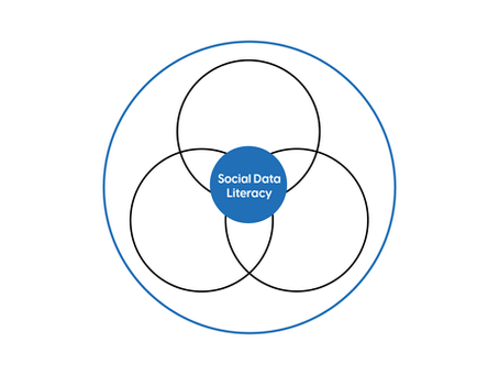
Every dataset is the product of choices. Most of the time those choices go unexamined because defaults are invisible. Social data literacy is the ability to see them.

Kat Greenbrook
3 min read


How to decide what data to analyse (a five-step framework)
Most people working with data have access to more of it than they can meaningfully use. The result is paralysis. This five-step framework gives your analysis direction before you begin.

Kat Greenbrook
3 min read
bottom of page
