Why your team's data isn't landing with stakeholders
- Kat Greenbrook

- Apr 28
- 3 min read
Updated: May 31
Most data professionals are very good at the analytical part of their job. The hard part comes when they have to communicate what they found.
Their presentation loses out to someone's phone. Their dashboard goes unopened. No one does anything with the insight that took two weeks to produce. This is one of the most common frustrations in data work (and something I've personally experienced). There are a few places where this tends to go wrong, and they're not always where teams look first.
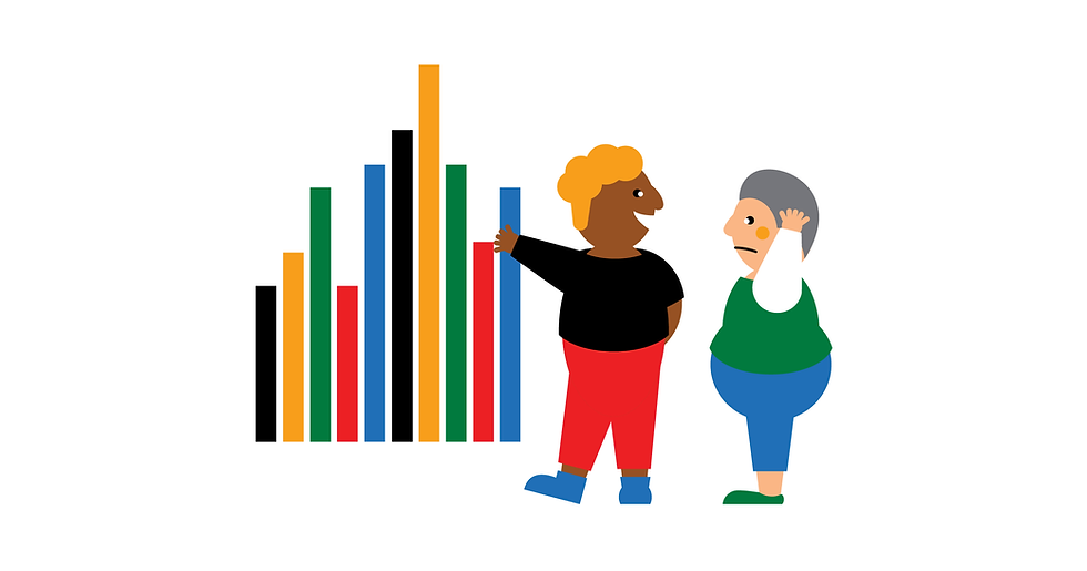
The visual isn't where the problem starts
When data doesn't land with stakeholders, the instinct is often to improve the visual. Make a better chart, a cleaner dashboard, a more polished slide. But communication often breaks down well before data visuals are designed.
Organisations are saturated with data visuals. I love the phrase "drowning in dashboards" because it's something I witness everywhere I work. The volume is high enough that stakeholders have learned, largely unconsciously, to filter most of it out. Don't get me wrong, a dashboard is extremely helpful for someone with the built-in context to understand its numbers. See Data storytelling vs data visualisation: what's the difference?
For everyone else, what cuts through this data viz noise is a message that connects the numbers to the audience. The visual may be where the problem shows up, but it's not where it begins.
Starting in the wrong place
A common pattern is that an analyst completes their work, then figures out how to present it. The communication is treated as something to sort out once the analysis is done.
The problem with this approach is that it puts the data work before understanding the audience and the organisation's goals. By the time the analyst is thinking about how to communicate, the decisions that shape the story (what to analyse, what to include, what to leave out) have already been made.
More effective work starts earlier. Before diving into analysis, it helps to zoom out. What problem is this work trying to solve? What goal is it serving? What action do you want your audience to take, and what would they need to understand before they could take it? See What is the PGAI Framework?
Those questions change what you look for in the data and how you communicate what you find. The analysis becomes easier to share because it was shaped by a communication goal from the start.
The message gets lost in the method
Another common pattern: analysts present their work the way they experienced it. They walk through the data, the methodology, the caveats, the findings. This makes sense from their perspective. But when data presentations lead with process, most people disengage. The exception is other analysts, who'll follow the methodology because they recognise it. Everyone else needs a different entry point.
Stories help people understand data. A narrative structure tells stakeholders what the data means, and what action it calls for. For most people, the numbers can't do this on their own.
What changes when teams learn to communicate strategically
The change that makes the biggest difference is treating communication as part of the data work from the beginning. That means understanding the business context before building anything. It means knowing your audience before choosing your format. And it means presenting a message.
Teams that develop these skills start producing work that gets acted on. Their recommendations carry weight. Over time, they move from supplying numbers to shaping decisions.
The shift from analyst to trusted advisor is available to most data teams. But it requires skills that most people haven't been formally taught. Training in data work has historically focused on the analysis. Communication is where they have real opportunity to improve.
The Data Storyteller's Handbook covers the frameworks that underpin strategic data communication, including how to ground your work in business context before you begin. If your team is ready to develop these skills in a structured way, Rogue Penguin workshops are designed to make that shift happen.
Kat Greenbrook is a data storytelling consultant, author, and workshop facilitator based in Wellington, New Zealand. She is the founder of Rogue Penguin and the author of The Data Storyteller's Handbook.

